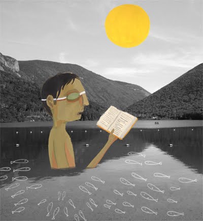
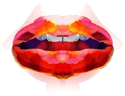
A really interesting mix of media. The work is quirky and playful yet doesn't loose it's sophistication. I like that the main basis of the work is black and white and the hints of colour that work their way in are a really nice contrast.
Small Stakes is a independent design studio that produces a range of print materials, including book covers, album packaging, T-shirt designs, screen-printed posters, and illustrations. His music posters have become a big fixture in the independent music scene.
I really love these screen print. They're so delicately witty and are always such nice designs. I really like the layering that is achieved by screen printing. Screen printing is a technique I'd really like experiment with.
Robert Rauschenberg was an American artist who came to prominence in the 1950s transition from Abstract Expressionism to Pop Art. . Rauschenberg was both a painter and a sculptor and the Combines are a combination of both, but he also worked with photography, printmaking, papermaking, and performance. He's often referred to as the kind of collage and has a very definite busy, thick style.
His work is very layered with a a large variety of media which I really like. There's always so much within each piece, the pieces are really full and thick of visuals.
An American artist who was involved in the pop art movement. He works especially in fragmented, disproportionate images and combining and overlapping imagery. He's been said to create visual stories with his work.
I really really like this work, a really interesting take on collage and great use of colour. The feel of the pieces is almost dark, very different to traditional collage work. It adds an interesting twist to the traditional nostalgic collage.
Jackie works with recycled paper and printed ephemera. Her work is very handmade graphic imagery, she works in collage, print and photography. Her work is know worldwide and has had commissions for packaging, book design and brand development.
I'm a real fan of Jackies work. It's well considered juxtapositions against warm nostalgic throwbacks. Her work has such a nice air about it, it's so delicate and friendly. The colours are lovely as are the used imagery. This lady obviously has a good eye.
Hiroshi's illustrations started as clean woodcuts and have developed into refined and sophisticated drawings. Much of his work is used as fashion illustration and has appeared throughot America, Europe and Japan.
I really really like Tanabe's work. It's so clean and refined and has a real delicacy. The layering is so well considered and doesn't complicate or upset the image at all. His choice of colour is so well done and the pieces just have such a nice feel to them.
Herr Mueller is an illustrator and Graphic Designer based in Berln. He says he focuses on editorial illustration and personal works have been in past exhibitions. He also occasionally publishes handmade zines.
I really enjoy Mueller's work. He has a real variation in his pieces. I especially like his layered portraits. I really like the delicacy they hold and his use of colour.